The internet, and ways we access it, is always evolving… and so does the web design. New techniques come and go, and designers always need to be ready to accept the novelty and get used to the changes. The ever-changing, fast-moving nature of modern web design gives designers more opportunity to expand horizons and create something out of the ordinary, creative, and highly unique.
2013 proves to hold just as much change in web practice as the previous years and has already brought some exciting new trends that some one page websites are already using. If you don’t already know what they are, the following will bring you up to speed.
Responsive Design
Responsive design is a must have in today’s world. a responsive design displays a website at the optimal size for different devices and screens. It is not a new trend in web design, but more and more designers are adopting this technique as this trend grows from year to year. Taking into account the number of users who prefer browsing websites on their mobile device or tablets, 2013 became the year that responsive design really took off. In addition, responsive design offers the simplest way to reach the target audience across multiple devices so this is make for perfect use in a one page designs.
Here’s a great example of a responsive one page website.
Parallax Designs
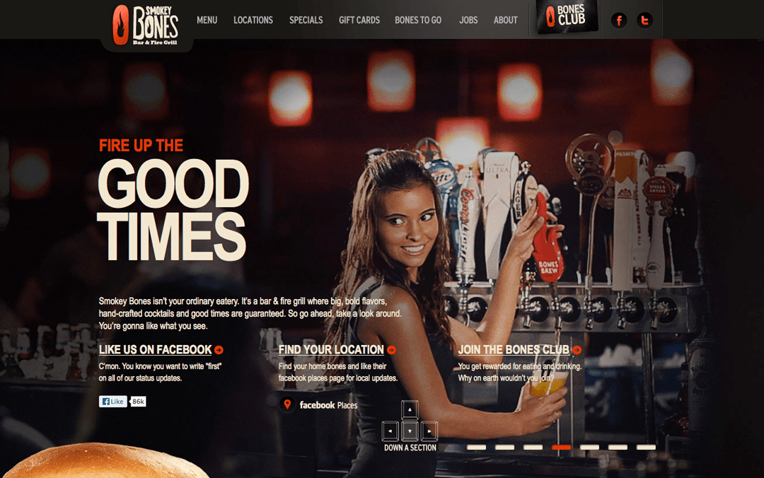
Parallax scrolling has been around a couple years. Nike World, Smokey Bones Bar, and Ben The Bodyguard were among the first to feature this effect and it has become more mainstream since. Parallax is a special scrolling technique where background images move slower than the foreground images on the screen resulting in a 3D illusion. The parallax feature can also present multiple backgrounds, content and images without the need for multiple pages. Perfect for single page websites!
Love how the burger comes together on this responsive one-pager:)
Flat Web Designs
Flat website deign or Flat UI has been one of the most talked about trends in web and user interface design this year. It has become more popular after Apple showed the world the new flat iOS7 interface design earlier this year. At first, designers had negative feedback about this new flat design… but within a few months, flat designs were popping up everywhere – especially on one page web sites.

Designers still have mixed feelings (they are touchy creatures:)) about this style of design, but overall flat design is a good approach – keeping the UI simple and easy to use and navigate. Effects like gradients and noise do not make a design good, it should focus on being clear and easy to use. I think flat design brings more diversity in our designs, but is starting to become overused. Also, even though flat design seems to make the UI simpler, it isn’t right for every website. If a flat design can be used while keeping your message clear, go ahead and use it, but don’t make a trend or a visual style more important than your website’s content.
Here’s a great example of a one page site with a flat design.
Big Backgrounds
Full-screen background images are a powerful way to get your visitors interested in your site. If done correctly, large images can speak louder than and typed message you might say. Large images can tell you message straight after somebody enters your site, which is another reason why they work so well on one page websites.
Web typography
Web fonts have come a long way over the years. With technologies like @font-face and Typekit, more fonts are available to designers to make their one page sites stand out. These web fonts are built for any and all screens and can be re-sized using jQuery or CSS3 media queries. Web-safe fonts present all kinds of new possibilities for making fonts look as attractive as the content it’s expressing. Keep an eye out for more expressive fonts and larger font sizes in one page sites.
Social Media Integration
Another trend for 2013 is Social Media Integration. This is a great way to share websites, help people follow your brand, and increase viewers of your website. Integrating social sharing on your website design will increase user engagement and brand awareness. Many one page sites are already taking advantage of social media integration.
Data Integration
More and more designers are also starting to use toolkits to bring data directly into their one page web design. Instead of designing static data visuals and uploading them into a website, data-driven elements are actually part of the website from the start. The result: interactive data visualizations that are also crawl-able by search engines that can make even the barest one pager informative. Tools like this continue the trend of making data part of the single page website’s design process.
Here’s a one page website example with lots of data integration.


Leave a Reply